LinkedIn Carousel: What It Is Today, the Real Specs, and How to Build One Worth Keeping
A LinkedIn carousel is a PDF today: anyone can download it, you cannot edit it after posting, and its links do not click. Official limits and a page plan.

A LinkedIn carousel today is a PDF. You upload a document, LinkedIn shows it page by page, and people swipe through it in the feed.
That one fact changes how you should build it. Anyone who sees the post can download the file, you cannot fix a page after publishing, and the links inside do not click in the feed.
I work as a Marketing Engineer: digital since 12, full marketing since 20. This guide covers what LinkedIn officially says, where the popular sizes come from, what the 2026 studies measure, and the page plan I start from.
Key Takeaways
- A LinkedIn carousel is a document post. You upload a PDF, PPT or DOC file and LinkedIn turns it into swipeable pages; the old photo carousel was removed in 2023.
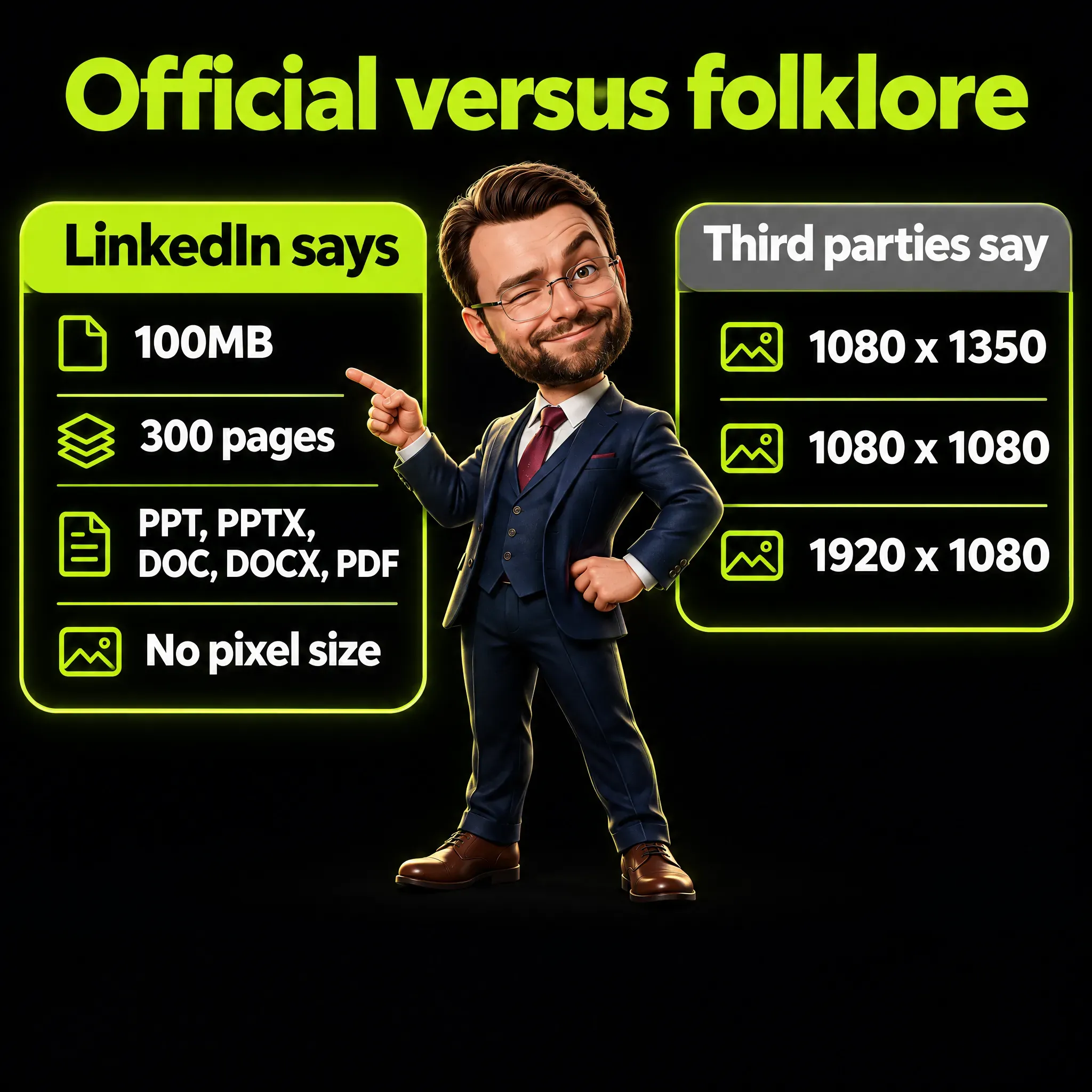
- LinkedIn gives no pixel size for organic documents. The official limits are 100 MB and 300 pages; 1080 x 1350 is advice from third parties, and a sensible one for phones.
- The file leaves LinkedIn. Everyone who can see the post can download it as a PDF, so put your name on every page and a source next to every number.
- You get one shot. After posting you can edit the description, never the document, so a typo on page 3 means delete and repost.
- Links inside the PDF do not click in the feed. Write the address out in full on the page and repeat it in the post text or the first comment.
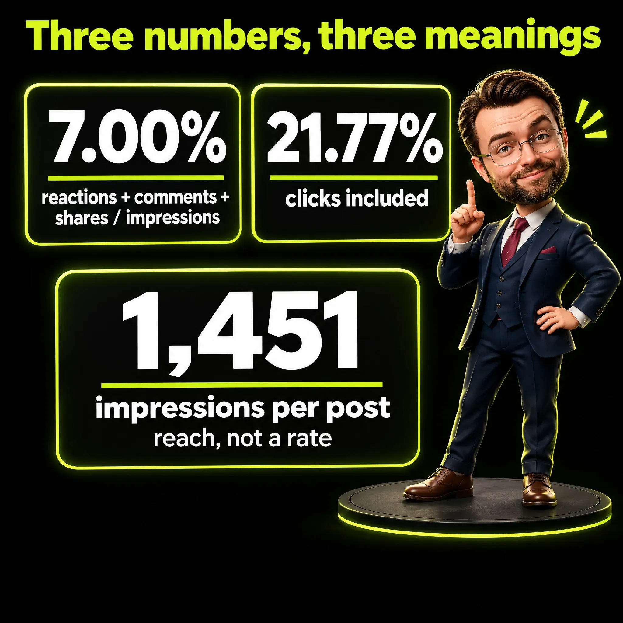
- The headline engagement numbers depend on the formula. Socialinsider reports 7.00% for 2025 and 6.40% for the third quarter of 2026, Buffer reports 21.77%, and much of the gap comes from the formula: Buffer’s figure includes clicks.
What Is a LinkedIn Carousel in 2026?
A LinkedIn carousel is a document post: one file, shown as pages you swipe through. The help page for it never uses the word carousel, and it is titled Upload and share documents on LinkedIn.
The word suggests a set of images, like on Instagram, while the thing you upload is closer to a small brochure.
In LinkedIn’s own pages the word belongs to advertising. Carousel ads are a paid format with their own rules, and mixing the two is where most of the confusing advice online comes from.

What Happened to the Old Swipeable Photo Carousel?
It was removed. LinkedIn added a native carousel for photos and videos in July 2022 and closed it less than a year later.
Hootsuite reported the first step in June 2023: “As of June 26, 2023, LinkedIn will no longer support photo carousels, profile videos, or embedded link stickers.” Social Media Today then published the notice LinkedIn sent to members: “Starting on December 14th, 2023, we’ll be removing all carousels and profile videos from LinkedIn.”
Both dates come from trade media quoting LinkedIn, because the original help page no longer exists. What remains today are two organic options: the document post and the multi-image post.
How Do You Post a LinkedIn Carousel, Step by Step?
You post it as a document from the normal post box. The help page gives this path:
- Click Start a post.
- Click More, then Add a document.
- Click Choose file and select your PDF.
- Add a title for the document and click Done.
- Write the post text, which LinkedIn calls the description.
- Click Post.
One post takes one file. The title field matters more than it looks, and LinkedIn explains why: “Add a title to your document to let members know what your document is about.”
What Are the Official Limits for a LinkedIn Carousel File?
The official limits are about weight, pages and file type, not pixels. The help page says: “The file size cannot exceed 100MB and 300 pages.” The supported types are PPT, PPTX, DOC, DOCX and PDF.
LinkedIn adds four technical requests on the same page:
- “Convert files to PDFs whenever possible to ensure the highest quality upload.”
- “PDFs with multiple layers must be flattened or merged”
- “PDFs with multiple sized pages must be fit to the same page size.”
- “Videos and other animations in documents aren’t supported and will display as static images instead.”
What Size Should a LinkedIn Carousel Be?
LinkedIn does not give a pixel size for organic documents. The help page contains no dimensions at all, and the specs for document ads only say “Aspect Ratio: Vertical, Horizontal, Square”.
The numbers you see everywhere come from tool vendors. Oktopost writes: “The recommended dimensions for LinkedIn carousels (document posts) in 2026 are 1080 x 1350 px (portrait, 4:5 aspect ratio), 1080 x 1080 px (square, 1:1), or 1920 x 1080 px (landscape, 16:9).”
The vendors do not agree with each other. One guide recommends 4:5 in one section and in another section writes: “Ensure your carousel slides are 1080 x 1080 pixels (1:1 square ratio), as this performs best.”
My suggestion is 1080 x 1350, vertical. The reason is plain geometry: a tall page takes more of a phone screen than a square one, and most of my pages need room for one big sentence and one visual. If you reuse the same pages on other platforms, square is a fair compromise.
What Changes When Anyone Can Download Your Carousel?
Your carousel stops being a post and becomes a file that travels. LinkedIn states it directly: “For accessibility purposes, members who can view your post will be able to download your document as a PDF.”
A downloaded PDF has no feed around it: no profile photo above it, no post text, no comments. Whoever opens the file a month later, or receives it from a colleague, sees only the pages.
So I plan for two things. My name and role go on every page, because a single page can be cut out and forwarded, and the source sits next to every number, because nobody can ask me where it came from. I also add one summary page that makes sense alone, since that is the page worth saving.
What If You Find a Typo After Posting?
You delete the post and publish it again. LinkedIn is clear on this point: “You can edit the description of your document or remove the post after it’s uploaded, but you can’t change or edit the document in the post.”
A text post can be corrected in ten seconds, and a document cannot. If the mistake shows up after the first comments arrive, you choose between a visible error and losing the conversation.
So the review happens before the upload, page by page, on a phone screen. My drafts start with AI help, and this is the step for human-in-the-loop verification, which means a person checks the machine’s work before it goes out. I check every number and every name before the file exists.
Do Links Inside a LinkedIn Carousel Work?
Not in the feed. The clearest official sentence is about document ads: “Hyperlinks in the document will only be clickable if the member downloads the document.”
For organic documents the help page only asks you to make sure your PDFs “have secure hyperlinks”. It never says a link can be clicked in the viewer, so I plan as if it cannot. Hootsuite’s guide reads it the same way: “you cannot include clickable elements within your document or presentation.”
I applied this on the third version of a carousel I was preparing: the last page got a box with the address written out in full, where a button would normally go. Keep the address short enough to type, and repeat it in the post text or the first comment.
Do LinkedIn Carousels Get More Engagement Than Other Posts?
They sit at the top or level with the top in the 2026 studies I read, but the size of the lead depends on the formula. Two sources give engagement rates that are far apart, and a third measures reach instead.
Socialinsider studied 2.45 million posts from brand pages and counts reactions, comments and shares divided by impressions. Its benchmark page reports that “native documents have pulled ahead to claim the top spot, scoring a LinkedIn average engagement rate of 7.00%”.
Buffer looked at posts sent through its own tool and reports a much bigger figure, this time a median and not an average: “Carousels earned a median engagement rate of 21.77%”, against 7.35% for video and 3.18% for text. Buffer adds the key warning itself: “LinkedIn, for example, includes clicks in its engagement rate, while most other platforms don’t”.
Metricool measured reach instead: “We looked over 673,658 posts from 63,108 LinkedIn accounts”, and carousels averaged 1,451.19 impressions per post against 605.57 for video. On comments, single images did better: 2.80 per post against 2.38 for carousels.
Metricool offers an explanation for the gap: “LinkedIn is tracking every time someone swipes through your carousel”, and those actions count toward the engagement rate. If that is right, a format built on swiping gains in any formula that includes clicks. The samples also differ, brand pages in one study and one tool’s customers in the other, so the formula explains much of the gap and not all of it.
Before you put one of these numbers in a marketing report, write down which formula produced it.
Is the LinkedIn Carousel Losing Ground in 2026?
The lead got smaller, and no study I read shows a collapse. In Socialinsider’s quarterly data the format has company at the top: “Native documents and multi-image posts were LinkedIn’s most engaging formats in Q3 2026, both averaging a 6.40% engagement rate by impressions”.
So with a formula that ignores swipes, a document and a plain set of images perform the same. Be careful when you compare 7.00% with 6.40%, because the two figures cover different periods and different samples from the same publisher.
Social Media Today, writing in April 2026 about Socialinsider’s 2026 report, added a caution: “this could be due to a lower presence of document posts in the overall sample, which could skew the data”. Fewer people make documents, and those who do tend to put more work into them.
One developer wrote on dev.to that they tested the same information in three formats, and “The text post got 5x the reach of the carousel.” It is one test with no method published, and a reminder that an average says little about one account.
How Many Pages Should a LinkedIn Carousel Have?
Between 8 and 12 is a fair starting range, and fewer is fine when the content is short. The hard limit is 300 pages, and for document ads LinkedIn itself suggests “under 10 pages”.
The largest data set I found comes from MagicPost: “We measured 67,765 LinkedIn carousels (PDF document posts) published over the last 12 months”. Median likes were 22 for carousels of 2 to 5 pages, 49 for 9 to 12 pages and 58 for 13 to 20 pages, while “The median carousel is only 8 slides”.
Read that with two cautions. MagicPost sells a carousel tool, and the author admits the limit of the data: “So part of the climb in these tables is the author behind the slides, not the slide count alone.”
For accounts above 50,000 followers the same study shows the peak at 9 to 12 pages and a dip after that. Socialinsider lands in the same place and calls “8-12 slides is a sensible starting range” its advice. Three of my four drafts stop at 6 or 7 pages, because the topics had no more steps than that and I add no page to fill space.
When Is a Carousel the Right Format, and When Is It a Normal Post?
A carousel fits a topic that is a list or a sequence of steps. A single idea is a normal post, even when the idea is good.
I learned this from my own review. In October 2026 I looked at a single-image draft on a topic made of separate points, and my note was that it looked nice but belonged in a carousel with a strong request at the end. The draft became an eight-page PDF, and the open question at the end became one exact word to write in the comments to receive a checklist.
That request is a design choice, and I present it as one. My own four drafts run to 8, 7, 6 and 6 pages, and what I share here is the design logic and the sources behind it.
The request has a cost. Every person who writes the word expects the checklist, so someone has to send it to each of them, and a row of one-word comments is not a conversation. Choose it only when you are ready to do that work.
When the idea is a single point, it becomes a normal post, and my guide on what to post on LinkedIn has 30 starting points for six situations, each with an example opening.
What Do People Say About LinkedIn Carousels in Forums?
The most useful comment I found is from someone who had never heard of the format. On Hacker News, a forum for people who work in tech, a reader looked at a carousel tool in 2022 and asked whether they had understood it correctly: “Carousels are like a slideshow that LinkedIn makes when you upload a PDF.”
If technical readers have to ask, the first line of your post should say what people are about to swipe through.
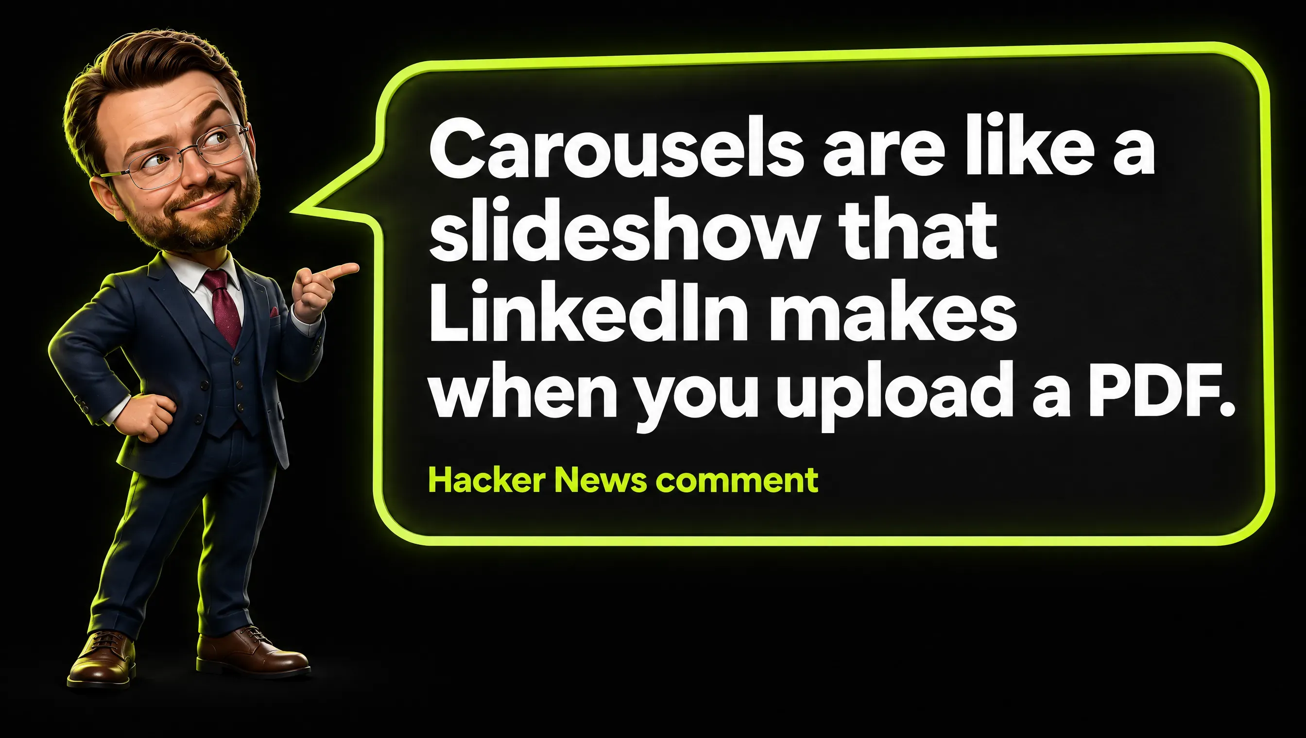
Real comment from Hacker News.
In 2026 a builder described the cost in time: “The manual workflow (Canva/Figma → resize → export → arrange → PDF) takes 20+ minutes.” The writer was promoting a tool, so the number is not neutral.
In 2023 another builder named the technical wall: “I need a clean HTML/CSS to PDF export functionality, but it’s proving challenging.” This matches the official requests: merged layers, equal pages, one clean file.
How Do I Structure a Nine-Page LinkedIn Carousel?
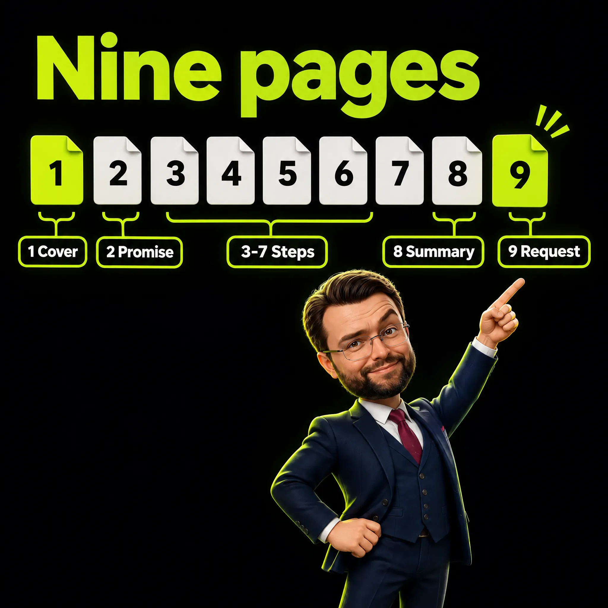
The skeleton I start from is cover, promise, one step per page, summary, request. My own drafts so far are shorter, 6 to 8 pages, so read nine as the full version to cut down. The topic below is invented for this article, and so is every line of copy in it.
Example topic: “5 checks before your landing page goes live”.
- Page 1, cover. One promise in six to nine large words and one visual that shows it, with no giant logo and no long subtitle.
- Page 2, promise and reason. Who it is for and what they will hold at the end: “For anyone who signs off pages without a developer next to them. Five checks, ten minutes.”
- Pages 3 to 7, one step per page. A numbered title with a verb, one sentence on how to do it, one concrete example or small drawing, always on the same grid.
- Page 8, summary. All five steps in one view, readable without the other pages.
- Page 9, request. One precise ask, for example “Comment CHECK and I’ll send you the one-page version.”
Every page carries a counter such as “3/9” and my name with my role at the bottom. The counter tells people how much is left, and the name stays with the page when the file is downloaded.
What Goes on Each Page?
One idea, a few large words, and something to look at. Those three rules came out of drafts I rejected.
In one review round I turned down two drafts. One was flat and gave no reason to stop scrolling, and my note on the other was “too much small text, too much to see”. A dense page is unreadable on a phone, and it also stops the swipe, which is the whole mechanic of the format.
The second lesson was about pages made only of headlines and big numbers. They are tidy and forgettable, so before I design a page I now ask one question: what does the reader see, before reading?
The answer can be a small scene, a metaphor, a chart with one highlighted bar, or a touch of humor. This is also my filter against AI slop, the name for machine-made content that looks finished and says nothing. Ten pages that say what would fit in two sentences are filler with page numbers.
Which Tool Should You Use to Make a LinkedIn Carousel?
Any tool that exports a clean multi-page PDF works. Slide tools such as PowerPoint, Google Slides and Keynote do it, and so do design tools such as Canva and Figma. LinkedIn’s help page sets rules for the file and names no tool.
The settings matter more than the tool:
- Set a custom page size once, for example 1080 x 1350, and use it for every page.
- Build one master page with the counter, your name and the margins.
- Export as a standard PDF and flatten it if the tool offers the option, which merges text, shapes and images into one layer per page.
- Open the PDF on your phone and read every page at arm’s length.
- Check the file size, which should sit far below 100 MB for a short carousel.
How Do You Make a LinkedIn Carousel Accessible?
Fill in the document title, keep the text large, and repeat the essential points in the post text. The title is the only field LinkedIn documents for this format, and the download exists for the same reason, since the help page introduces it with the words “For accessibility purposes”.
Alternative text is the short description that a screen reader reads aloud in place of a picture. LinkedIn documents it for images: the help page for photos describes an ALT button for each picture, and the page about documents describes no such field.
So the post text does that job. I write two lines on who the carousel is for, then list the steps in plain text, which serves screen reader users and everyone who never opens the document. For longer files LinkedIn’s nonprofit guide suggests the same: “Add an executive summary if you’re uploading a larger document (ex: a 25-slide deck) to let people know why it’s worth reviewing the whole thing.”
Carousel, Multi-Image Post or Carousel Ad: Which Is Which?
They are three different products with three sets of rules. Most wrong specs online come from copying the rules of one into a guide about another.
| Document post (the organic “carousel”) | Multi-image post | Carousel ad | |
|---|---|---|---|
| What you upload | One PDF, PPT or DOC file | Up to 20 images | 2 to 10 cards |
| Official size | None in pixels | At least 552 x 276, 1080 wide recommended, shown at 4:5 at most | 1:1, at least 1080 x 1080 |
| Weight limit | 100 MB, 300 pages | 5 MB per photo | 10 MB per card |
| Alt text | Not documented | Yes, per image | Not applicable here |
| Editable after publishing | Description only | Text only, photos are locked | Cards are locked once saved |
| Downloadable | Yes, as PDF | Not documented | Not documented |
The numbers for ads come from LinkedIn’s carousel ad specs, which also state that carousel ads do not support video. The figure for images comes from the photo help page: “Choose which files you’d like to upload (you can select up to 20 images).”
The limits are easy to mix up because guides cover both products on one page. Hootsuite’s carousel guide says “You can include anywhere between two and 10 images.” in its steps for a carousel ad, which matches the ad specs. The 20 belongs to the organic multi-image post.
Which Mistakes Do I Check for in a LinkedIn Carousel?
Most mistakes come from treating the PDF like a set of pretty images. These are the ones I check for:
- A clickable button on the last page. It does nothing in the feed, so write the address out.
- Pages of different sizes. LinkedIn asks that all pages be fit to the same size.
- A wall of small text. If you need to zoom on a phone, the page has failed.
- A cover that needs the post text to make sense. The cover must work alone in two seconds.
- Numbers without a source. The file gets downloaded, and an unsourced number then travels with your name on it.
- No proofreading pass. You cannot edit the document later.
- Quoting 21.77% without the formula. That figure includes clicks, and according to Metricool swipes count toward it.
- A carousel for a single idea. One idea is a post, and stretching it across ten pages wastes the reader’s time.
The Checklist Before You Publish
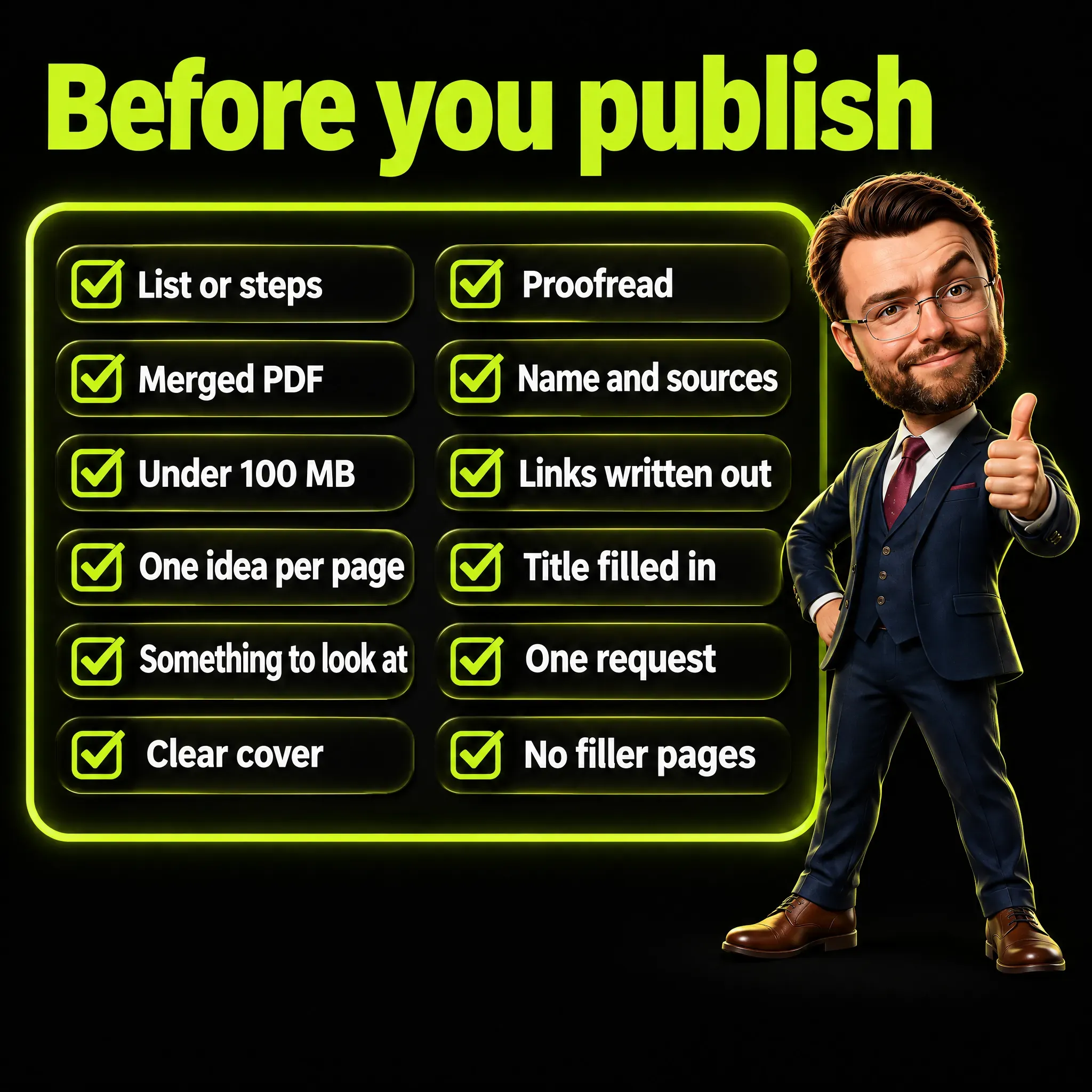
Run through these twelve points with the final PDF open on your phone:
- The topic is a list or a sequence of steps.
- The file is a PDF with merged layers and equal page sizes.
- It is under 100 MB and 300 pages, with no video or animation inside.
- Each page has one idea and a few large words.
- Each page has something to look at besides text.
- The cover makes sense alone in two seconds.
- Every page has been proofread, numbers and names included.
- Your name and role are on every page, and every number has a source.
- Links are written out in full and repeated outside the PDF.
- The document title is filled in, and the key points are in the post text.
- The last page has one precise request.
- No page exists only to add length.
After publishing, watch what the format does on your own account. The guide on LinkedIn impressions explains what that number counts, and the best time to post on LinkedIn covers when to publish. People who tap your name on page one land on your profile, so read LinkedIn headline examples and LinkedIn profile optimization before you upload.
Frequently Asked Questions
Can you still post a carousel on LinkedIn?
Yes, as a document post. You upload a PDF, PPT or DOC file and LinkedIn shows it page by page; the native photo carousel was removed in 2023.
What size should a LinkedIn carousel be?
LinkedIn gives no pixel size for organic documents; its specs for document ads list vertical, horizontal and square, and the help page asks that all pages match. Third parties recommend 1080 x 1350 for phones or 1080 x 1080 for reuse across platforms.
How many slides should a LinkedIn carousel have?
The technical limit is 300 pages and 100 MB. A reasonable starting range is 8 to 12 pages, and one study of 67,765 carousels found a median of 8.
Are links in a LinkedIn carousel clickable?
Not in the feed. According to LinkedIn’s page on document ads, hyperlinks work only after the member downloads the document, so write the address out and repeat it in the post text.
Can people download my LinkedIn carousel?
Yes. Members who can view the post can download the document as a PDF, which is why every page should carry your name and your sources.
Can I edit a LinkedIn carousel after posting?
You can edit the description only. To correct a page you have to remove the post and upload the document again.
What is the difference between a carousel and a multi-image post?
A document post is one downloadable file with a title, and a multi-image post is a gallery of up to 20 pictures with alt text for each. In the third quarter of 2026 Socialinsider measured both at a 6.40% engagement rate by impressions.
How do I make a LinkedIn carousel in Canva?
Create a design with a custom size of 1080 x 1350 px and build one page per idea. Then choose Share, Download, PDF Standard, and tick Flatten PDF if Canva shows it. Upload that file on LinkedIn through Start a post, More, Add a document.
A LinkedIn Carousel Is a Document People Keep
A LinkedIn carousel is a document that people can keep and forward without you in the room. Build it that way: one idea per page, your name and sources on each one, the link written out, and one clear request at the end.
The format still sits at the top of the engagement tables, with a smaller lead than the headlines suggest. Use it when your topic is a list or a set of steps, and write a normal post when it is not.
I write about marketing, AI and the pages I build. If this guide was useful, follow me on LinkedIn.